14 KiB
English | 简体中文
Usage
- After click the action button, the form modal will display.
- After click the
Confirmbutton, theloadingstatus will be displayed according to the status of request. - After click the
Cancelbutton, the modal form will disappear. - If the request is sent successfully, a prompt message of successful action will be displayed in the upper right corner, and it will automatically disappear after a few seconds.
- If the request fails, an error message will be displayed in the upper right corner of the form page, which can only disappear after clicking the close button.
- Support batch action, after selecting multiple items in the table, you can click the action button above the table to perform batch action.
ModalAction code file
src/containers/Action/ModalAction/index.jsx
ModalAction attribute and function definitions introduction
- Modal forms are all inherited from
ModalActioncomponent - Code location:
pages/xxxx/containers/XXXX/actions/xxx.jsx - For the case where the form item is relatively less, the modal form is usually used
- Only need to override some functions and the development of page will be completed
- Attributes and functions are divided into the following four types:
- The attributes and functions that must be override, mainly include:
- Action ID
- Action title
- Action permissions
- Judgment whether to disable the action button
- Form Item config
- Function to send request
- The attributes and functions that override in need, mainly include:
- Form default value
- Form size
- Form's label & content layout
- Whether it is an asynchronous action
- Resource name
- Whether to display the resource name in the prompt of the request result
- Action button text
- The attributes and functions that do not need to be override, mainly include:
- Whether the current page is a admin page
- The basic functions in the parent class, mainly include:
- Render page
- Display of request status
- Display of request results
- The attributes and functions that must be override, mainly include:
- See below for a more detailed and comprehensive introduction
The attributes and functions that must be override
-
id-
Static
-
Resource action ID
-
Need to be unique, only for all actions in the
actionsof the resource to be unique -
Must be override
-
Take attach volume as an example
src/pages/compute/containers/Instance/actions/AttachVolume.jsx:static id = 'attach-volume';
-
-
title-
Static
-
Resource action title
-
Take attach volume as an example
src/pages/compute/containers/Instance/actions/AttachVolume.jsx:static title = t('Attach Volume');
-
-
name-
Resource action name
-
Use the name in the prompt after the request
-
Take attach volume as an example
src/pages/compute/containers/Instance/actions/AttachVolume.jsx:get name() { return t('Attach volume'); }
-
-
policy-
Static (Fill in the policy that complies with the openstack rules here)
-
Action permission, if the permission verify failed, the action button will not be displayed on the resource list page
-
Take attach volume as an example
src/pages/compute/containers/Instance/actions/AttachVolume.jsx:static policy = 'os_compute_api:os-volumes-attachments:create';
-
-
aliasPolicy-
Static (Fill in the custom policy with module prefix here)
-
Action permission, if the permission verify failed, the action button will not be displayed on the resource list page
-
Take attach volume as an example
src/pages/compute/containers/Instance/actions/AttachVolume.jsx:static aliasPolicy = 'nova:os_compute_api:os-volumes-attachments:create';
-
-
allowed-
Static
-
Determine whether the action button needs to be disabled
-
Return
Promise -
Button that no need to be disabled, write directly:
static allowed() { return Promise.resolve(true); } -
Param
item, the item data in the resource list is generally used to determine the action of the item in the resource list. -
Param
containerProps, parent container's (That is, the resource list page where the button is located)propsattribute, generally used to determine the action of related resources under the details page. -
Take attach volume as an example
src/pages/compute/containers/Instance/actions/AttachVolume.jsx:- The admin page does not display the action button
- The button will show when the server is not: active / deleting / locked / ironic
static allowed = (item, containerProps) => {
  const { isAdminPage } = containerProps;
  return Promise.resolve(
    !isAdminPage &&
      isActive(item) &&
      isNotDeleting(item) &&
      isNotLocked(item) &&
      !isIronicInstance(item)
  );
};
-
-
formItems-
The form item configuration list corresponding to the action
-
The configuration of each form item can be referred to 3-10-FormItem introduction
-
Take attach volume as an example
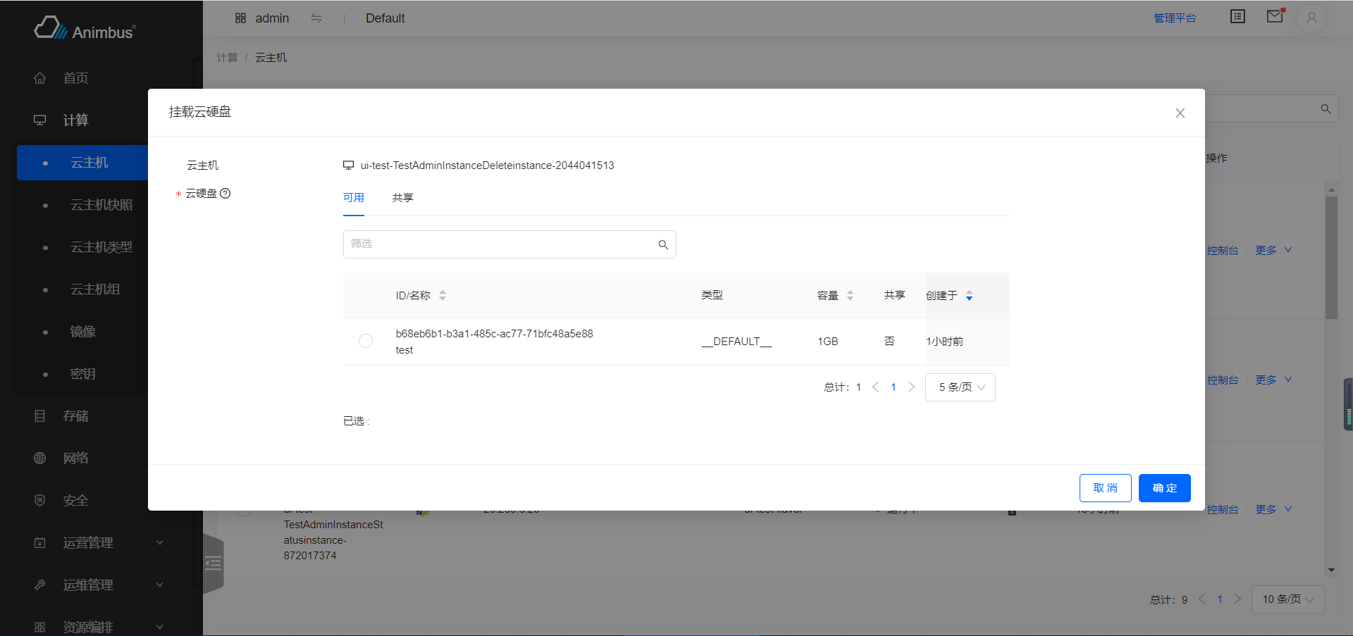
src/pages/compute/containers/Instance/actions/AttachVolume.jsx:- Form items includes: instance name label, volume selector
get formItems() {
  return [
    {
      name: 'instance',
      label: t('Instance'),
      type: 'label',
      iconType: 'instance',
    },
    {
      name: 'volume',
      label: t('Volume'),
      type: 'volume-select-table',
      tip: multiTip,
      isMulti: false,
      required: true,
      serverId: this.item.id,
      disabledFunc: (record) => {
        const diskFormat = _get(
          record,
          'origin_data.volume_image_metadata.disk_format'
        );
        return diskFormat === 'iso';
      },
    },
  ];
}
-
-
onSubmit-
The request function of the action
-
After the action request is successful, the modal will disappear, and a successful prompt will be displayed, and the prompt will disappear after a few seconds
-
After the action fails, the modal will disappear and an error message will be displayed. You need to close the prompt manually before the prompt disappears.
-
Return
Promise. -
Return the function in the
storethat corresponding to the form. -
Take attach volume as an example
src/pages/compute/containers/Instance/actions/AttachVolume.jsx:onSubmit = (values) => { const { volume } = values; const { id } = this.item; const volumeId = volume.selectedRowKeys[0]; const body = { volumeAttachment: { volumeId, }, }; return this.store.attachVolume({ id, body }); };
-
The attributes and functions that override in need
-
init-
Initial operation
-
Defines
this.storein it,loadingstatus is based onthis.store.isSubmitting -
Call the function to obtain other data required by the form in it
-
Update attributes in
this.state. -
Take attach volume as an example
src/pages/compute/containers/Instance/actions/AttachVolume.jsx:- Defines the corresponding
storefor the action
init() { this.store = globalServerStore; } - Defines the corresponding
-
-
defaultValue-
The initial value of the form
-
Default value is
{} -
Take attach volume as an example
src/pages/compute/containers/Instance/actions/AttachVolume.jsx为例- Set the initial value of the server name in the form
get defaultValue() {
  const { name } = this.item;
  const value = {
    instance: name,
  };
  return value;
}
-
-
nameForStateUpdate-
Update key-value into
this.statewhen form item value changed -
The key-value stored in
this.stateoften affect the display of form items, generally need to be used withget formItems- Such as expand and hide more configuration items
- Such as the
requiredattribute change of some form items
-
By default, the change of form item which
typeisradioormorewill automaticly save tothis.state -
Take attach interface to instance as an example
src/pages/compute/containers/Instance/actions/AttachInterface.jsx:- After select network in the form, the content of the subnet list will be updated
- However, after select the subnet in the form, the judgment of the input IP will be updated, etc.
get nameForStateUpdate() {
  return ['network', 'ipType', 'subnet'];
}
-
-
instanceName-
After the request is sent, the resource name in the prompt message
-
Default is
this.values.name -
Take edit fip as an example
src/pages/network/containers/FloatingIp/actions/Edit.jsx:- The prompt name is the address of the floating IP
get instanceName() {
  return this.item.floating_ip_address;
}
-
-
isAsyncAction-
Whether the current action is an asynchronous action
-
Default is
false -
If is asynchronous action, the prompt will be :
The xxx instruction has been issued, instance: xxx. \n You can wait for a few seconds to follow the changes of the list data or manually refresh the data to get the final display result. -
If is synchronous action, the prompt will be :
xxx successfully, instance: xxx. -
Take attach volume as an example
src/pages/compute/containers/Instance/actions/AttachVolume.jsx:get isAsyncAction() { return true; }
-
-
messageHasItemName-
Whether to include the instance name in the prompt of the request result
-
Default is
true -
For some resources without
nameattribute, you can set the valuefalse -
Take create snat as an example
src/pages/network/containers/Router/Snat/actions/Create.jsx:get messageHasItemName() { return false; }
-
-
buttonText-
Static
-
When the text on the action button is inconsistent with the title of the modal, this attribute needs to be override
-
Take edit image as an example
src/pages/compute/containers/Image/actions/Edit.jsx:static buttonText = t('Edit');
-
-
buttonType- Static
- The type of button, support
primary,default,link
-
isDanger-
Static
-
Support boolean
false,true, the default value isfalse -
When the button is to emphasize the risk of action, the button or the text on the button is generally red, use
true -
As the example of disable cinder service
src/pages/configuration/containers/SystemInfo/CinderService/actions/Disable.jsx:static isDanger = true;
-
-
modalSize-
Static
-
Identifies the width of the modal: the value is
small、middle、large -
The correspondence between value and width is :
small: 520middle: 720large: 1200
-
Use with
getModalSize -
Default is
small, means the width of modal is 520pxstatic get modalSize() { return 'small'; } -
Take attach volume as an example
src/pages/compute/containers/Instance/actions/AttachVolume.jsx:- the size of modal is
large
static get modalSize() { return 'large'; } getModalSize() { return 'large'; } - the size of modal is
-
-
getModalSize- Identifies the width of the modal
- The value is
small、middle、large
-
labelCol-
Configure the layout of the labels on the left side of the form
-
Default is :
get labelCol() { const size = this.getModalSize(); if (size === 'large') { return { xs: { span: 6 }, sm: { span: 4 }, }; } return { xs: { span: 8 }, sm: { span: 6 }, }; } -
Take edit domain as an example
src/pages/identity/containers/Domain/actions/Edit.jsx:get labelCol() { return { xs: { span: 6 }, sm: { span: 5 }, }; }
-
-
wrapperCol-
Configure the layout of the content on the right side of the form
-
Default is :
get wrapperCol() { return { xs: { span: 16 }, sm: { span: 16 }, }; } -
Take manage metadata of flavor as an example
src/pages/compute/containers/Flavor/actions/ManageMetadata.jsx:get wrapperCol() { return { xs: { span: 18 }, sm: { span: 20 }, }; }
-
The attributes and functions that do not need to be override
isAdminPage- Whether current page is a "management platform" page
successText- Successful prompt generated after the request
errorText- Error prompt generated after the request fails
containerProps- Get the
propsof the father component of the button
- Get the
item- Get the data of the item that the action corresponding to
items- Get the data corresponding to the batch action
The basic functions in the parent class
ModalActionextendsBaseForm- Recommend to see
src/components/Form/index.jsx